October 27, 2024
Kylix
Multi-chain Lending Platform
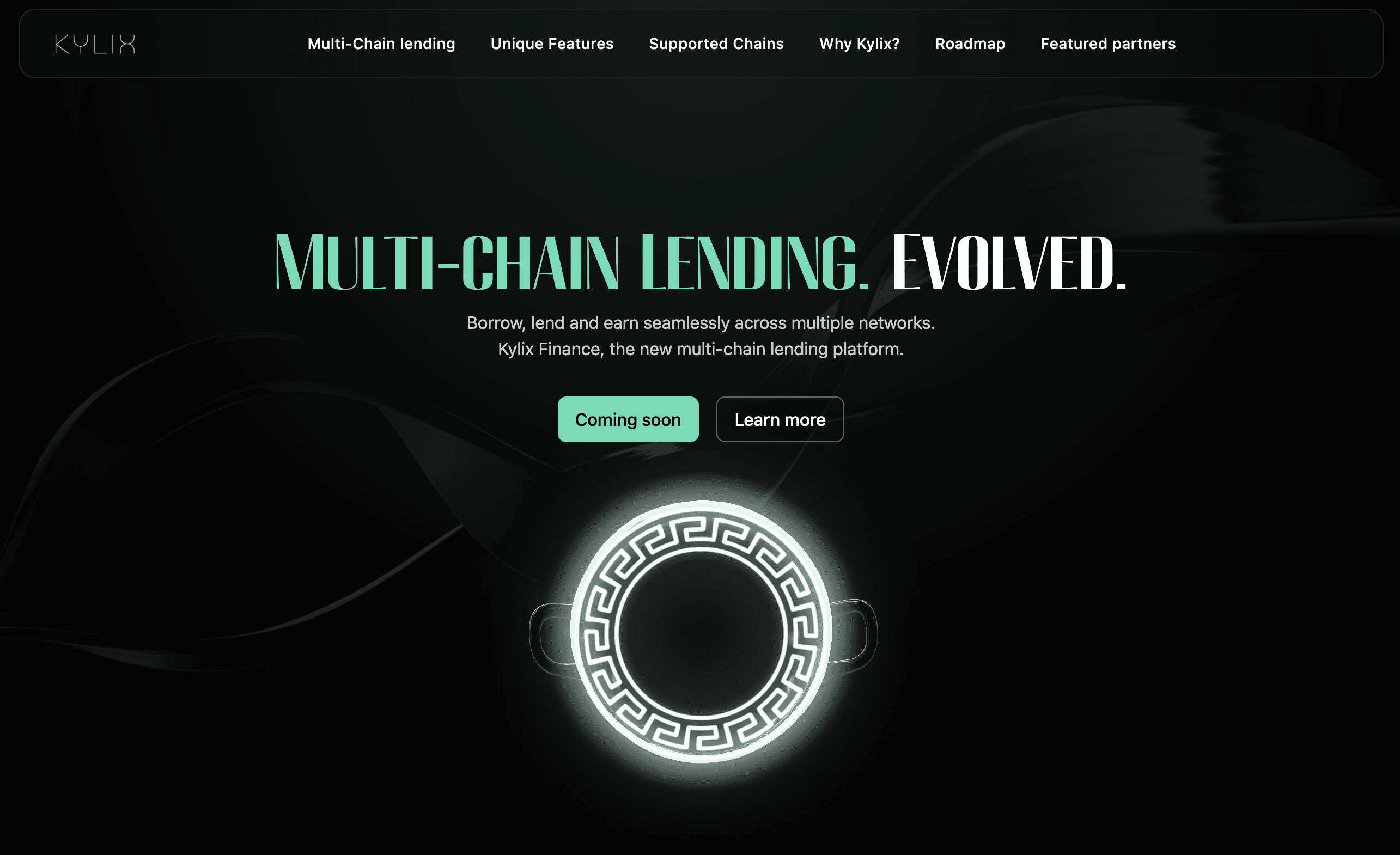


As part of the Kylix Finance project—a decentralized finance (DeFi) platform focused on native multi-chain lending—we undertook the challenge of designing a dashboard that would serve as the central hub for users to manage their financial activities. The goal was to create a seamless, intuitive, and visually striking interface that catered to both novice and experienced users while addressing the unique complexities of cross-chain DeFi operations.This case study documents the process, challenges, and outcomes of designing the Kylix Finance dashboard, which is now featured in my portfolio as an example of modern, user-centric design.
Project Goals
The dashboard was envisioned as a tool to:
Provide users with a clear and unified view of their assets across multiple blockchains.
Simplify complex financial operations such as lending, borrowing, and collateral management.
Offer real-time updates and actionable insights to enhance decision-making.
Maintain a high standard of security and transparency.
Scale effectively as the platform grows.
Challenges
Cross-Chain Data Integration
One of the core challenges was integrating data from multiple blockchain networks with differing protocols and ensuring it was displayed in real-time without delays or inconsistencies.Balancing Simplicity and Functionality
The dashboard needed to cater to both first-time DeFi users who required simplicity and advanced users who demanded detailed analytics and tools.Visualizing Complex Financial Data
Presenting intricate financial metrics such as interest rates, collateral scores, and liquidity pool utilization in an accessible way was critical.Scalability
The design had to accommodate future growth, including support for additional blockchain networks and increased user activity.Security Concerns
As a DeFi platform dealing with financial assets, ensuring data security and protecting user transactions were top priorities.
Design Process
1. Research & Discovery
To begin, we conducted in-depth research into user needs by interviewing stakeholders, analyzing competitor dashboards, and studying user behavior in similar DeFi platforms. Key takeaways included:
Users wanted a centralized view of their multi-chain portfolios.
Real-time updates on lending pools and transaction statuses were essential.
Simplicity was a recurring theme among less experienced users.
2. Wireframing
We created wireframes to map out the structure and flow of the dashboard. These initial designs focused on:
A clear hierarchy of information, starting with an overview of assets followed by detailed insights.
Streamlined navigation to ensure users could access key features with minimal clicks.
Modular components that could be easily expanded or adapted in future updates.
3. Visual Design
The visual design phase focused on creating an interface that was both aesthetically pleasing and functional:
A clean layout with ample white space to reduce cognitive load.
A color palette that differentiated key metrics (e.g., green for gains, red for risks) while maintaining visual harmony.
Integration of dark mode for better readability during extended use.
4. Development Collaboration
Working closely with developers, we ensured the design translated seamlessly into code. The front-end was built using React.js for responsiveness, while APIs fetched real-time data from multiple blockchain networks. Security features such as encryption and multi-signature authentication were integrated during this phase.
5. Testing & Iteration
User testing played a pivotal role in refining the dashboard:
Early feedback highlighted areas where navigation could be simplified further.
Advanced users suggested adding filters for deeper analysis of specific assets or transactions.
Iterative improvements ensured the final product met diverse user needs.
Key Features
Portfolio Overview
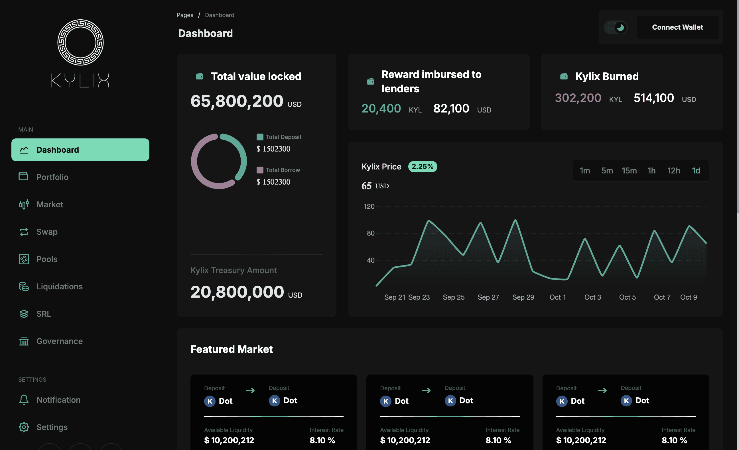
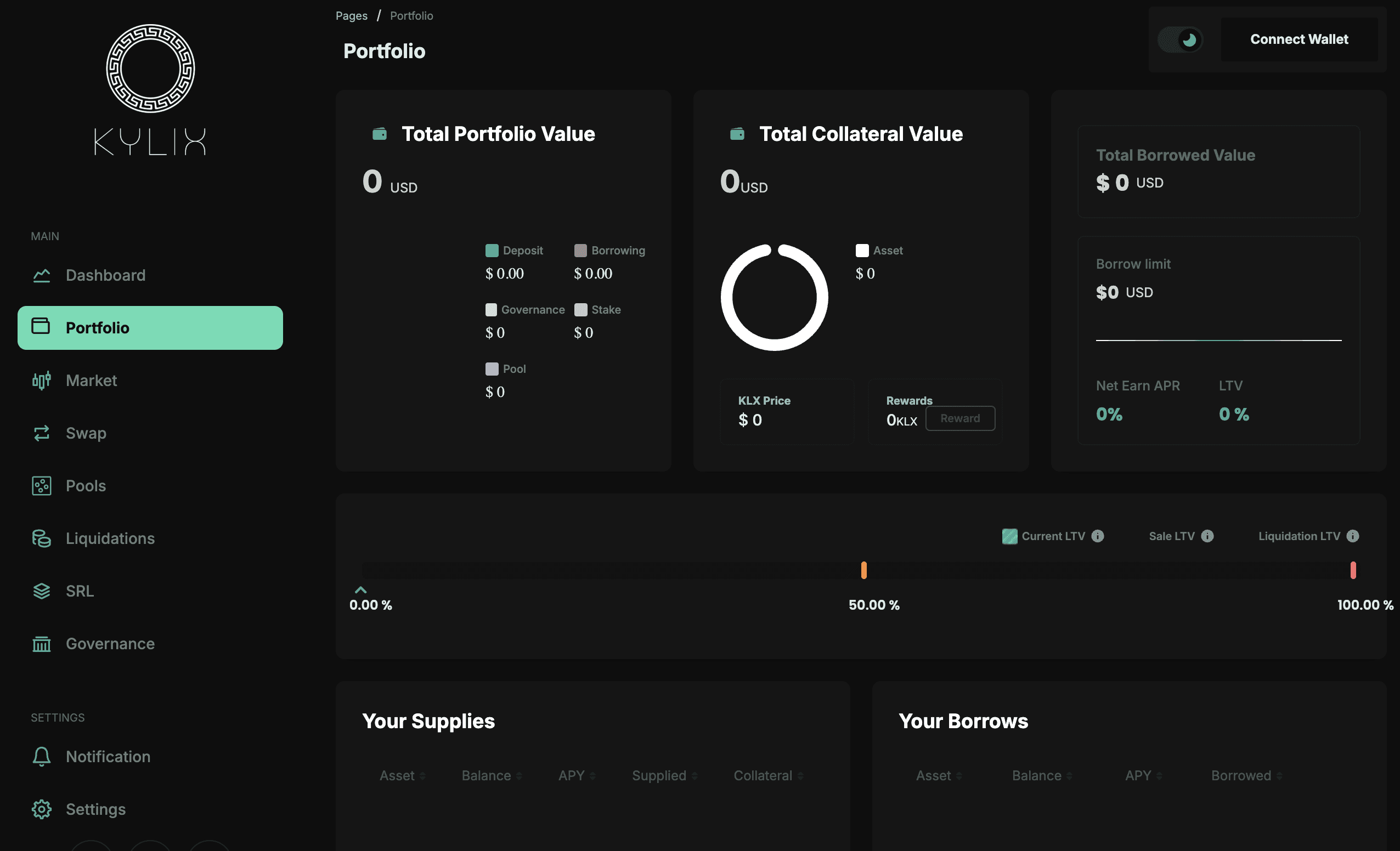
A centralized view displaying assets across multiple blockchains, complete with real-time valuations in both cryptocurrency and fiat currencies.Lending Pool Insights
Detailed information on interest rates, pool utilization, collateral health scores, and yield generation opportunities.Transaction Management
A streamlined interface allowing users to approve multiple tokens simultaneously or track pending transactions with ease.Real-Time Notifications
Alerts for gas fee fluctuations, liquidation risks, or transaction errors to keep users informed at all times.Interactive Data Visualization
Charts and graphs that allow users to drill down into specific metrics like historical yield trends or borrowing costs.
Outcomes
The final dashboard successfully achieved its objectives:
Improved User Experience
The intuitive layout reduced friction for new users while offering advanced tools for seasoned DeFi participants.Positive User Feedback
Beta testers praised the dashboard’s clarity, ease of use, and ability to provide actionable insights at a glance.Scalable Design
The modular architecture ensured smooth performance even during periods of high traffic or when new features were added post-launch.Enhanced Security
Robust security measures gave users confidence in managing their financial assets through the platform.
Conclusion
Designing the Kylix Finance dashboard was a rewarding challenge that required balancing technical complexity with user-centric design principles. By focusing on clarity, functionality, and scalability, we delivered a product that aligns perfectly with Kylix Finance’s mission to revolutionize multi-chain lending in DeFi.
As part of the Kylix Finance project—a decentralized finance (DeFi) platform focused on native multi-chain lending—we undertook the challenge of designing a dashboard that would serve as the central hub for users to manage their financial activities. The goal was to create a seamless, intuitive, and visually striking interface that catered to both novice and experienced users while addressing the unique complexities of cross-chain DeFi operations.This case study documents the process, challenges, and outcomes of designing the Kylix Finance dashboard, which is now featured in my portfolio as an example of modern, user-centric design.
Project Goals
The dashboard was envisioned as a tool to:
Provide users with a clear and unified view of their assets across multiple blockchains.
Simplify complex financial operations such as lending, borrowing, and collateral management.
Offer real-time updates and actionable insights to enhance decision-making.
Maintain a high standard of security and transparency.
Scale effectively as the platform grows.
Challenges
Cross-Chain Data Integration
One of the core challenges was integrating data from multiple blockchain networks with differing protocols and ensuring it was displayed in real-time without delays or inconsistencies.Balancing Simplicity and Functionality
The dashboard needed to cater to both first-time DeFi users who required simplicity and advanced users who demanded detailed analytics and tools.Visualizing Complex Financial Data
Presenting intricate financial metrics such as interest rates, collateral scores, and liquidity pool utilization in an accessible way was critical.Scalability
The design had to accommodate future growth, including support for additional blockchain networks and increased user activity.Security Concerns
As a DeFi platform dealing with financial assets, ensuring data security and protecting user transactions were top priorities.
Design Process
1. Research & Discovery
To begin, we conducted in-depth research into user needs by interviewing stakeholders, analyzing competitor dashboards, and studying user behavior in similar DeFi platforms. Key takeaways included:
Users wanted a centralized view of their multi-chain portfolios.
Real-time updates on lending pools and transaction statuses were essential.
Simplicity was a recurring theme among less experienced users.
2. Wireframing
We created wireframes to map out the structure and flow of the dashboard. These initial designs focused on:
A clear hierarchy of information, starting with an overview of assets followed by detailed insights.
Streamlined navigation to ensure users could access key features with minimal clicks.
Modular components that could be easily expanded or adapted in future updates.
3. Visual Design
The visual design phase focused on creating an interface that was both aesthetically pleasing and functional:
A clean layout with ample white space to reduce cognitive load.
A color palette that differentiated key metrics (e.g., green for gains, red for risks) while maintaining visual harmony.
Integration of dark mode for better readability during extended use.
4. Development Collaboration
Working closely with developers, we ensured the design translated seamlessly into code. The front-end was built using React.js for responsiveness, while APIs fetched real-time data from multiple blockchain networks. Security features such as encryption and multi-signature authentication were integrated during this phase.
5. Testing & Iteration
User testing played a pivotal role in refining the dashboard:
Early feedback highlighted areas where navigation could be simplified further.
Advanced users suggested adding filters for deeper analysis of specific assets or transactions.
Iterative improvements ensured the final product met diverse user needs.
Key Features
Portfolio Overview
A centralized view displaying assets across multiple blockchains, complete with real-time valuations in both cryptocurrency and fiat currencies.Lending Pool Insights
Detailed information on interest rates, pool utilization, collateral health scores, and yield generation opportunities.Transaction Management
A streamlined interface allowing users to approve multiple tokens simultaneously or track pending transactions with ease.Real-Time Notifications
Alerts for gas fee fluctuations, liquidation risks, or transaction errors to keep users informed at all times.Interactive Data Visualization
Charts and graphs that allow users to drill down into specific metrics like historical yield trends or borrowing costs.
Outcomes
The final dashboard successfully achieved its objectives:
Improved User Experience
The intuitive layout reduced friction for new users while offering advanced tools for seasoned DeFi participants.Positive User Feedback
Beta testers praised the dashboard’s clarity, ease of use, and ability to provide actionable insights at a glance.Scalable Design
The modular architecture ensured smooth performance even during periods of high traffic or when new features were added post-launch.Enhanced Security
Robust security measures gave users confidence in managing their financial assets through the platform.


Conclusion
Designing the Kylix Finance dashboard was a rewarding challenge that required balancing technical complexity with user-centric design principles. By focusing on clarity, functionality, and scalability, we delivered a product that aligns perfectly with Kylix Finance’s mission to revolutionize multi-chain lending in DeFi.
